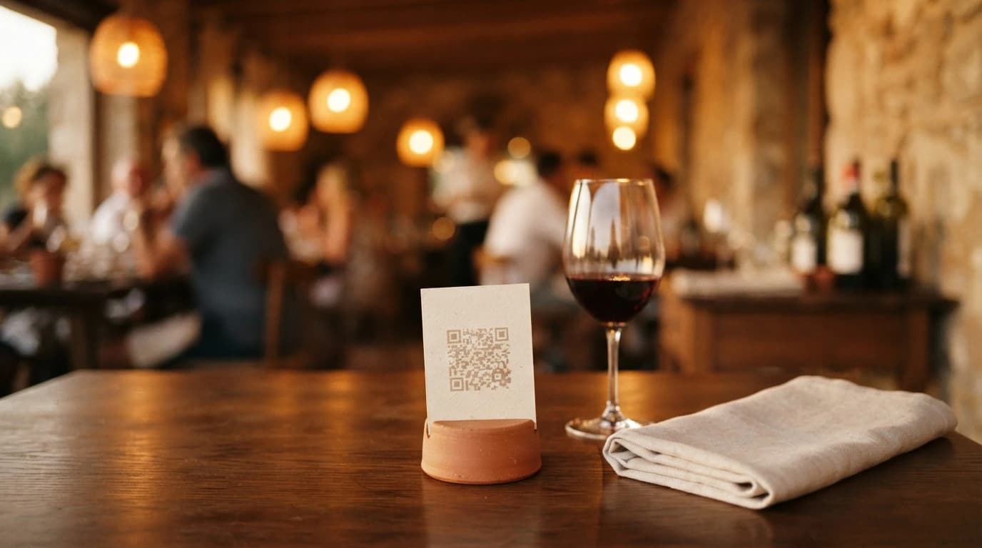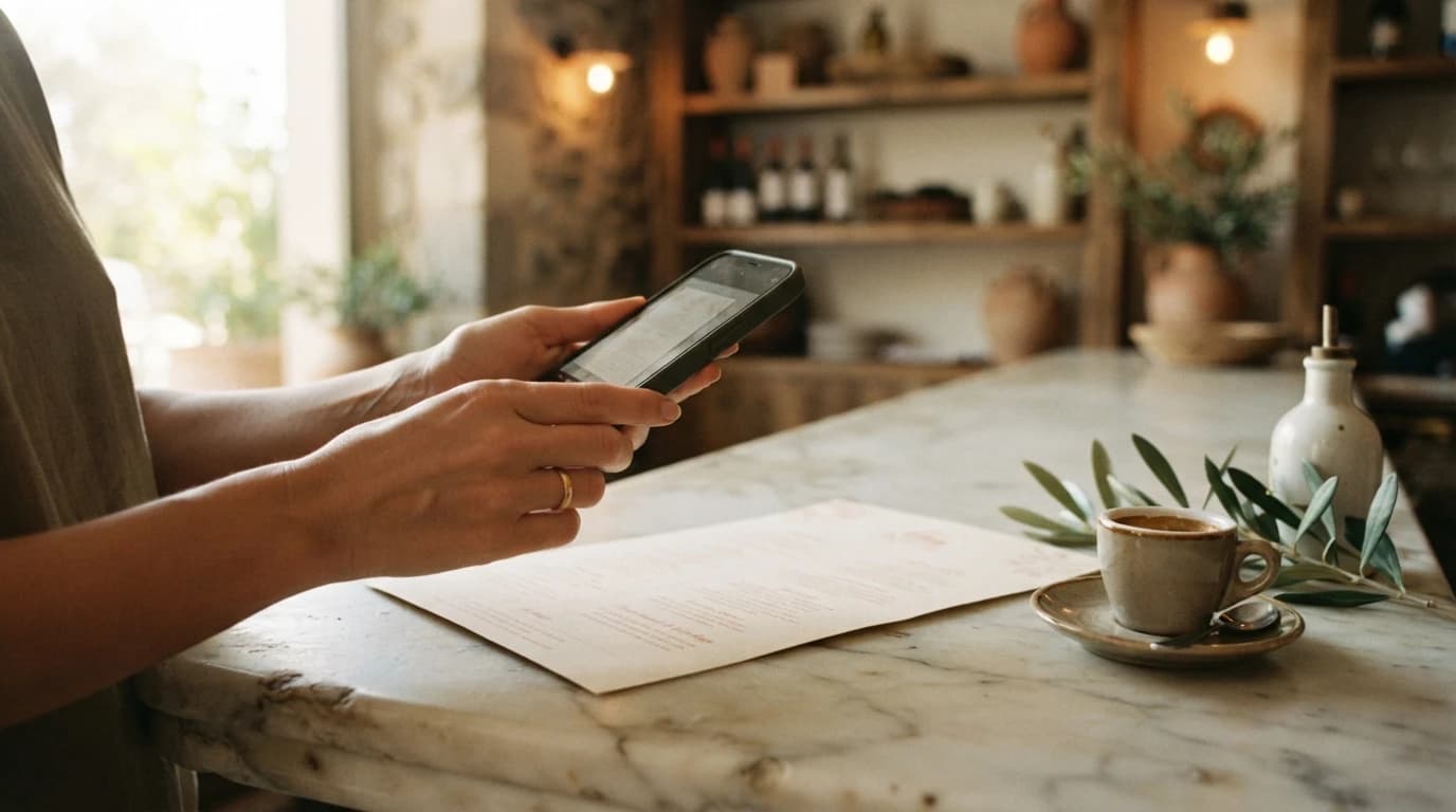
What a NUSA menu actually looks like
A digital menu can hold its own against a printed one. Here are our ten signature designs, each drawn for a different room.
A digital menu that doesn’t betray the room
Most tools hand you back the same page: white background, default typeface, one column of text. It works. It says nothing about your cooking, your room, or the care you put into receiving people.
Ours are drawn one at a time. A chosen typeface, a palette, a particular way of letting the page breathe. You are not picking a template off a list, you are picking an atmosphere that sits with your own.
The design doesn’t stop at the menu, either. It dresses the front page that comes before it — the one that introduces your house, your opening hours and your address. That is the page people land on when they look you up.
Ten QR code menu examples, drawn one by one
Scroll through the ten below. Each one adapts to your dishes, your photographs and the shape of your menu. From the moment you import, the preview runs on your own content — so what you judge is the real thing, before you publish anything.
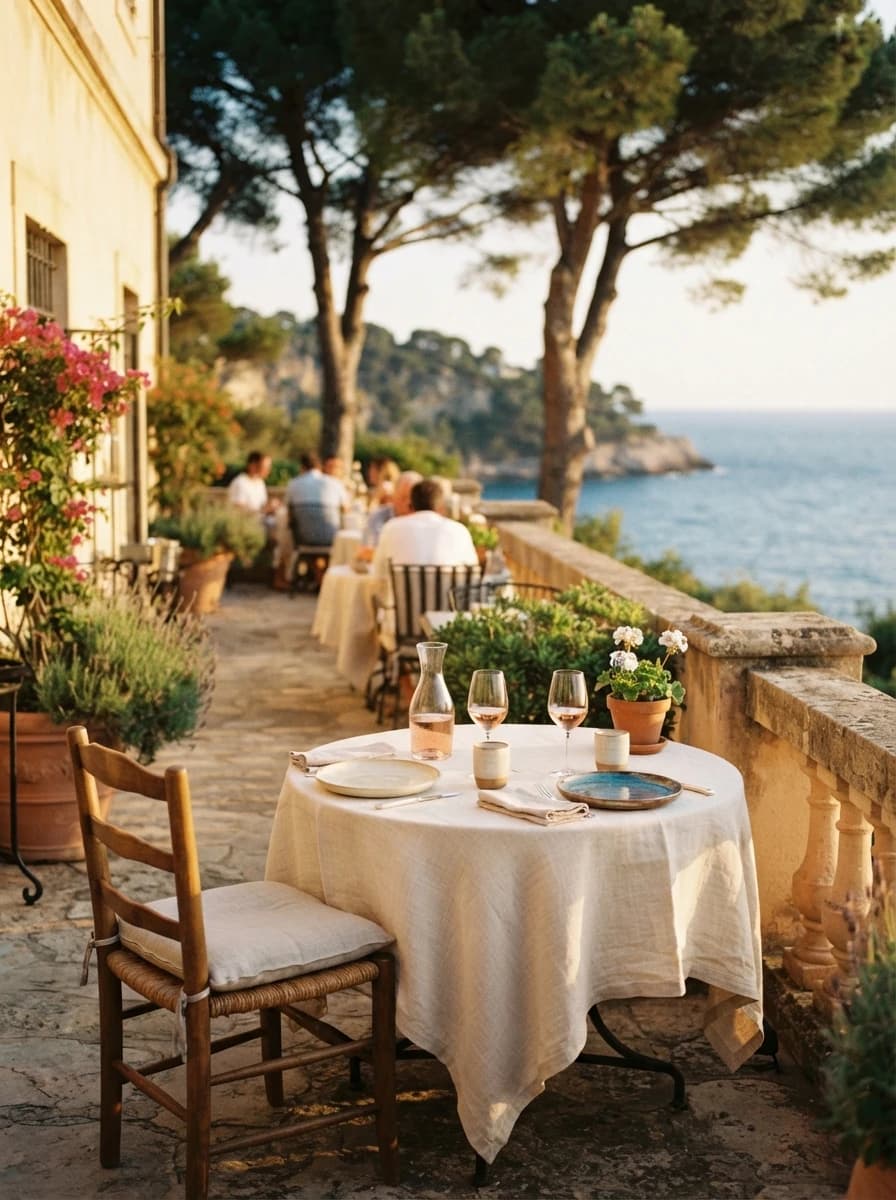
Riviera
Mediterranean dining, terrace and polish.
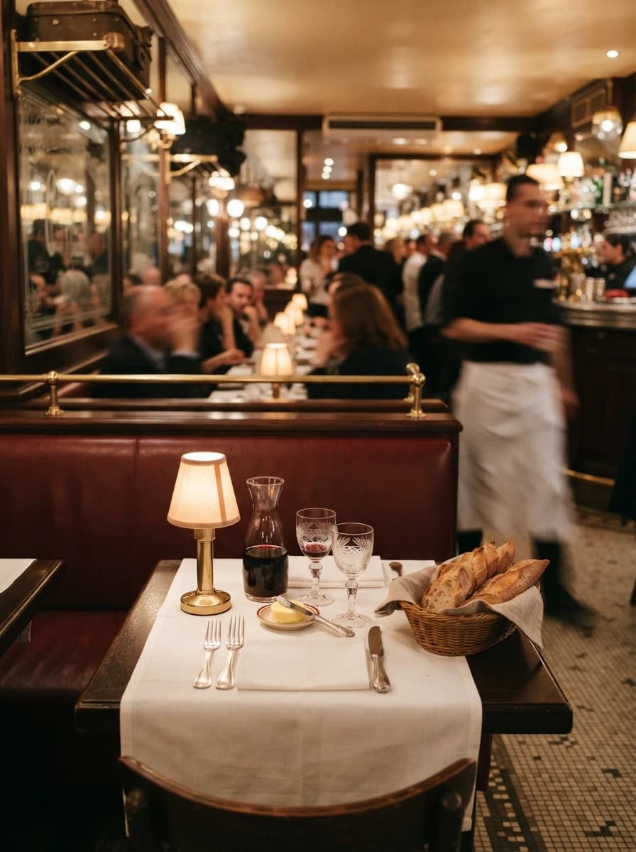
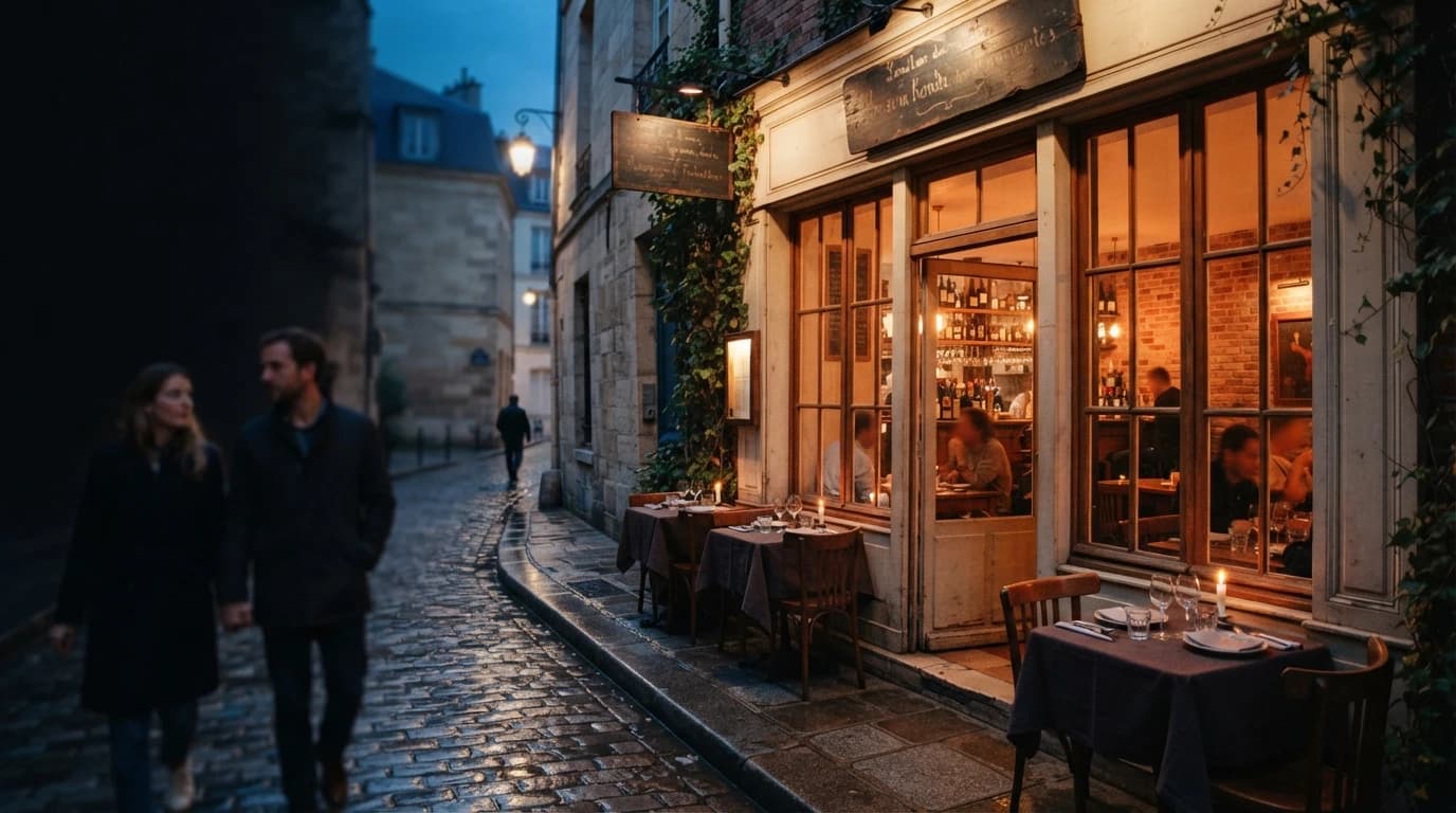
Maison
Classic brasserie, warm room and tradition.
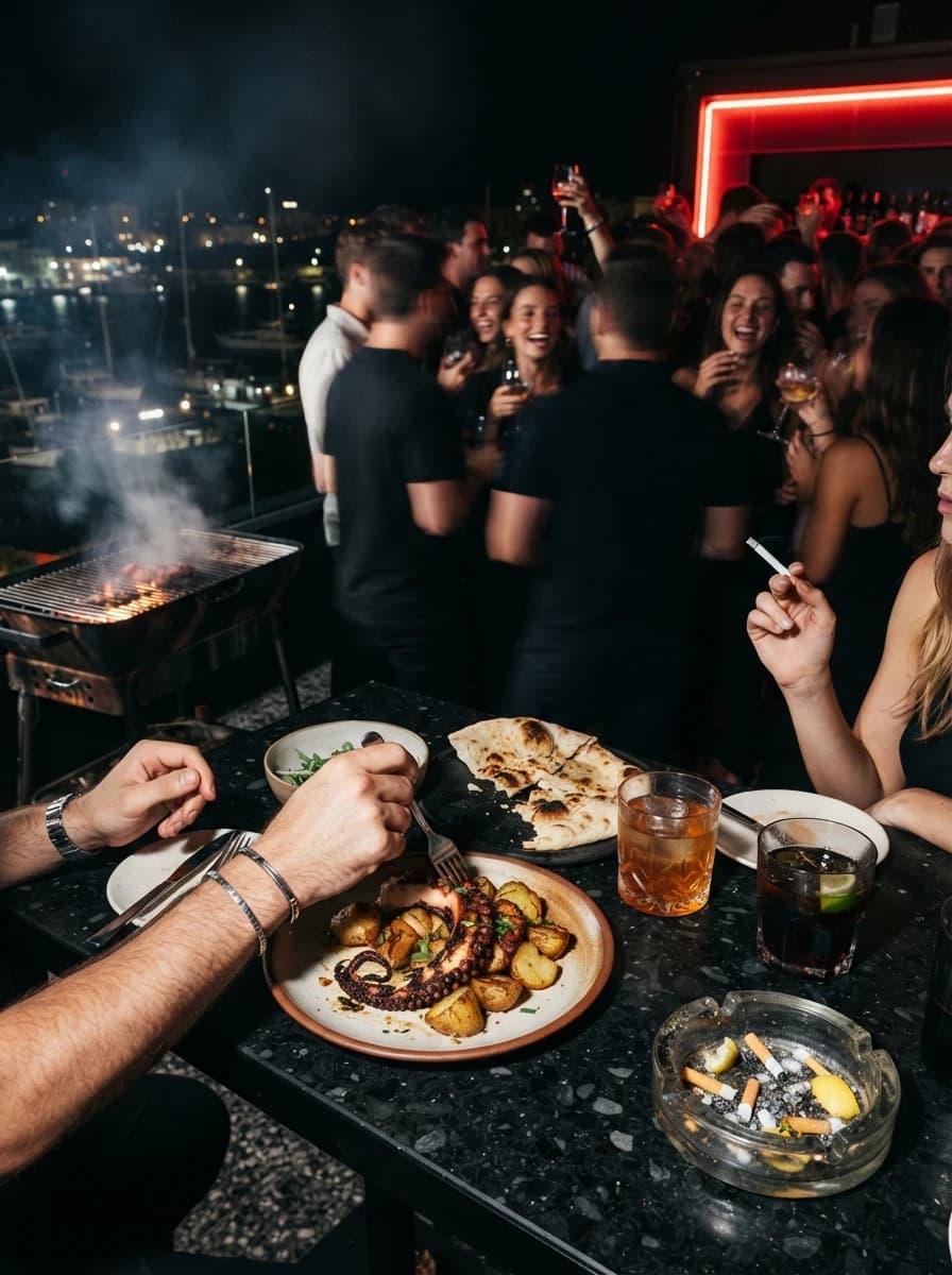
Social
Rooftop, bar and late-night kitchen.
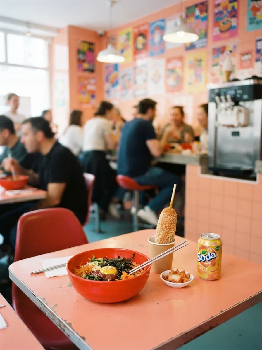
Pop
Bright canteen, street food and punchy energy.
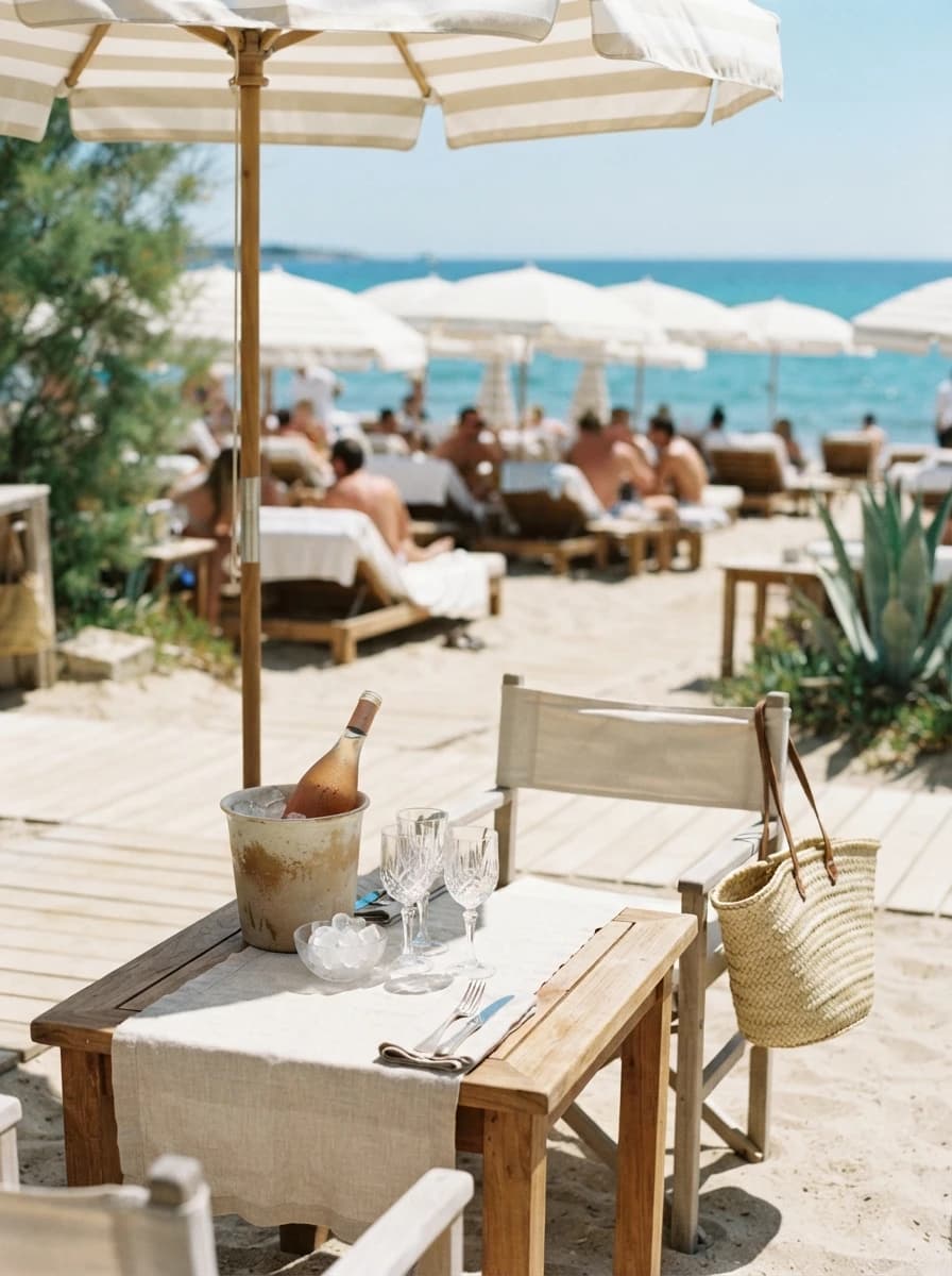
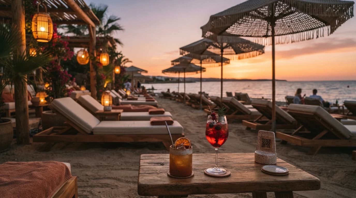
Beach Club
Beach club, cocktails and sand-side ease.
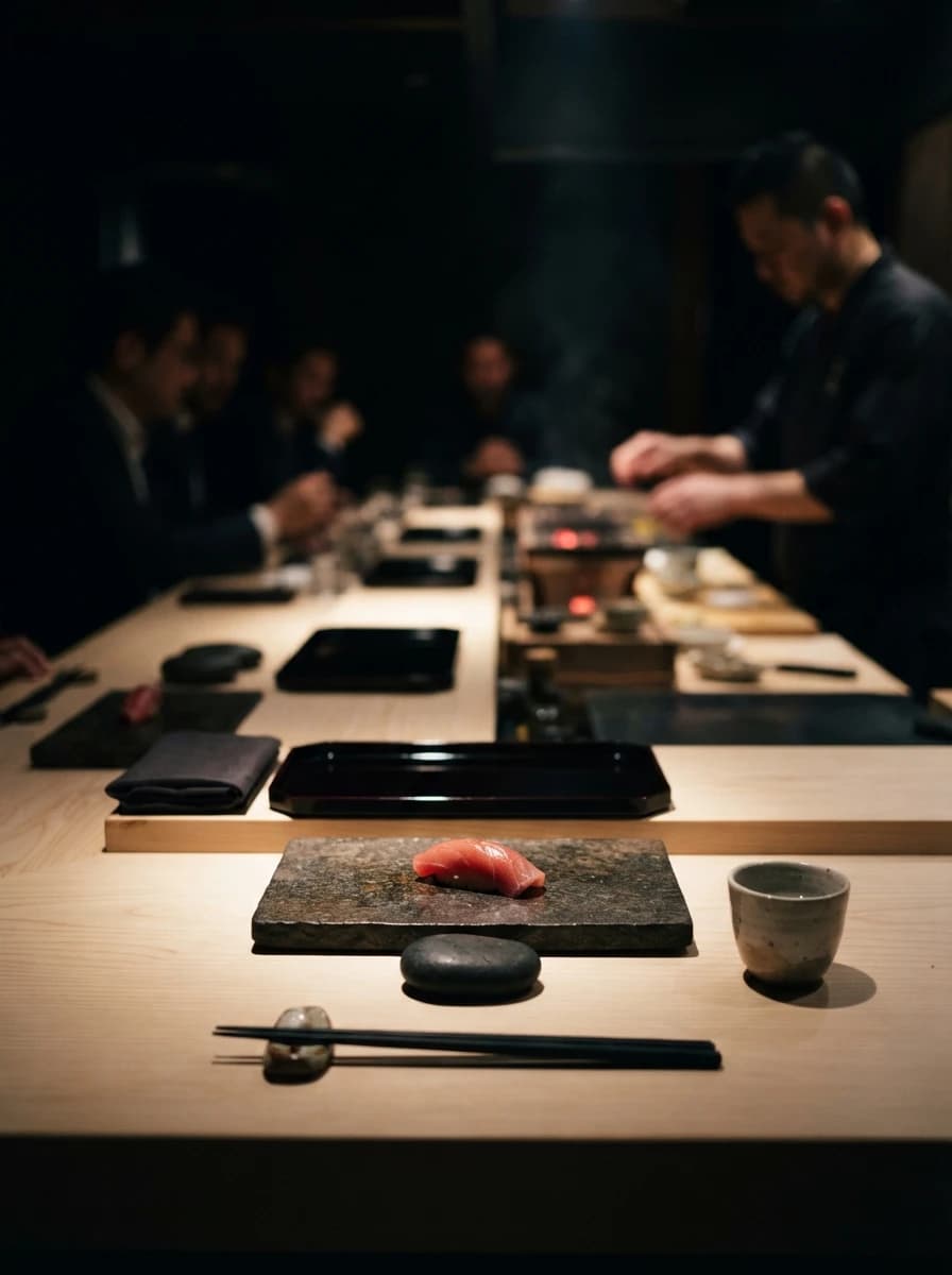
Noir
Fine dining, omakase and dark atmosphere.
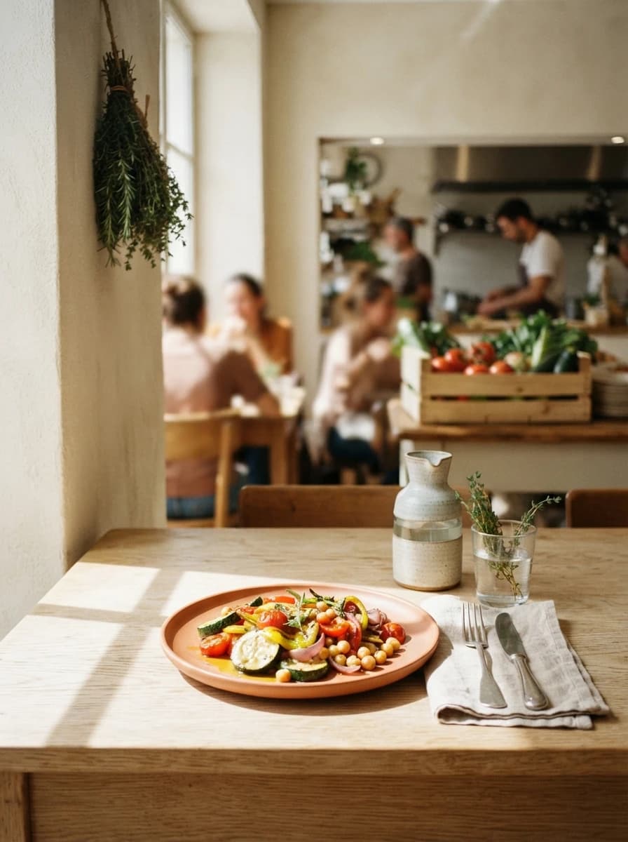
Terra
Plant-forward canteen, market and raw materials.
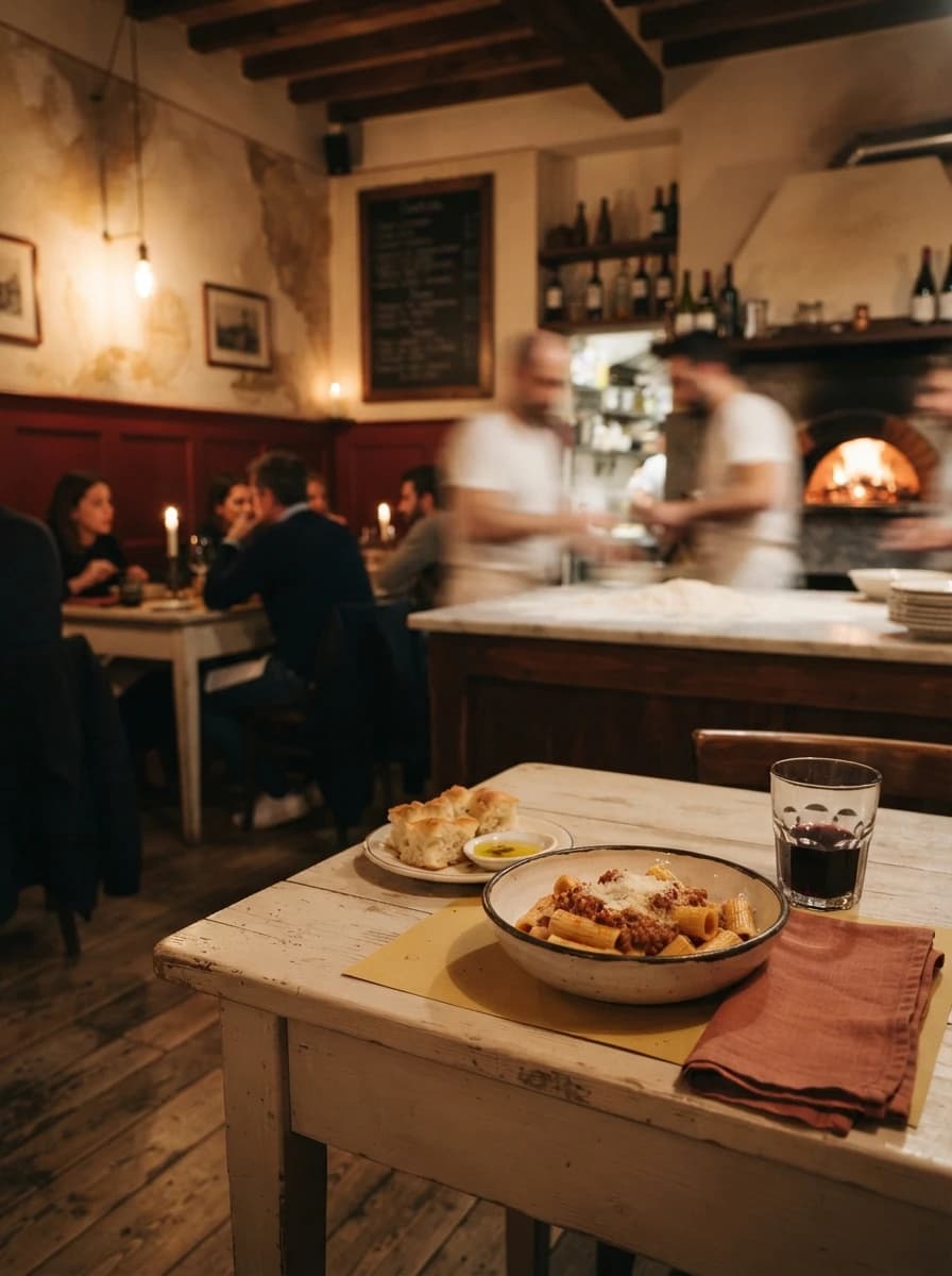
Trattoria
Neighbourhood osteria, pasta and pizza.
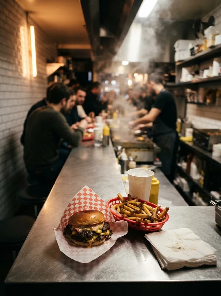
Counter
Counter service, burgers and street food.
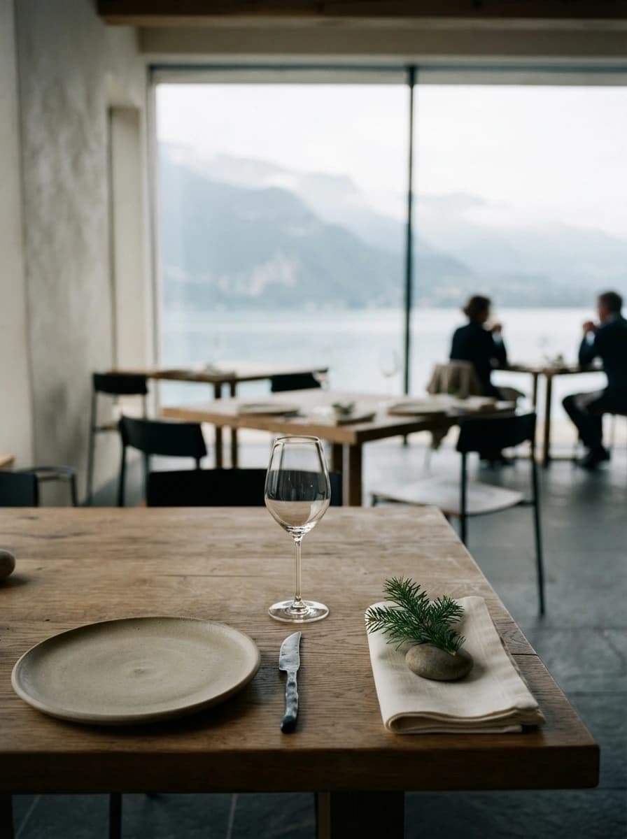
Atelier
Chef-driven tasting menu, precise and calm.
None of these designs fits your identity? Ask for a bespoke design.